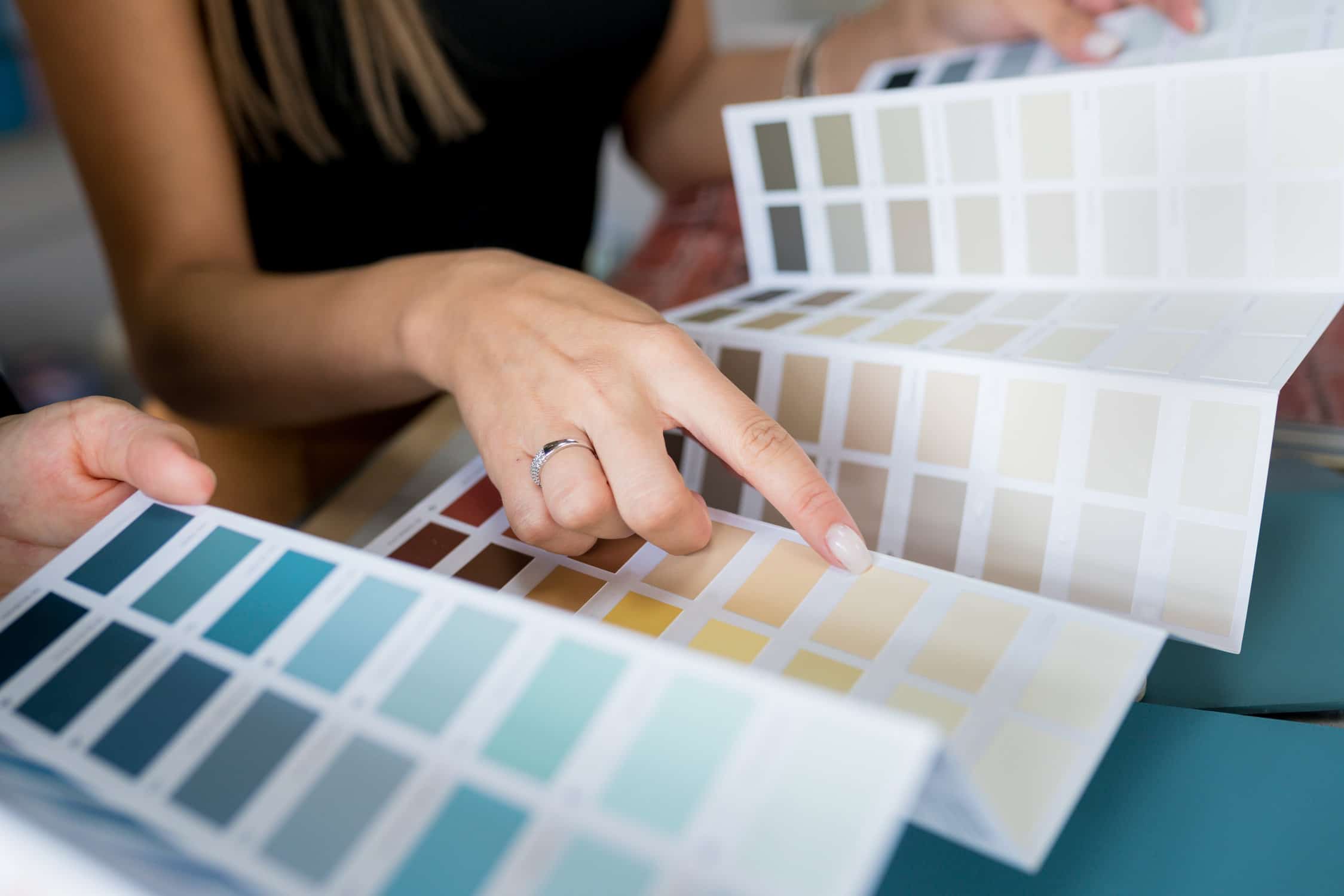
The first color came easily. Once you reached the second, paint color pairing became the part nobody warned you about. Maybe a sample looked clean in the store and faded against your wall. Maybe two greens you loved felt nothing alike when sitting side by side. Anyone learning how to pick a second paint color hits the same friction.
This article explains why the second pick feels harder, the rule that simplifies the choice, and how to know when a shade truly fits your room.
Key Takeaways

Why the Second Color Is Harder Than It Looks
The first color answers one feeling. You see the room in your head, and a shade matches the mood. The second color answers four problems at once. It has to fit the wall, the trim, the light, and the rooms it touches. Choices stack faster than the brain can sort them. A handful of swatches becomes a dozen. A dozen becomes thirty. Many homeowners freeze. They put the project aside for two weeks and feel guilty every time they walk past the empty wall. The freeze is real, and designers have a name for it. They call it an analysis stall, and it ends with more painting plans than any cost concern.
A Three-Part Test for Paint Color Pairing
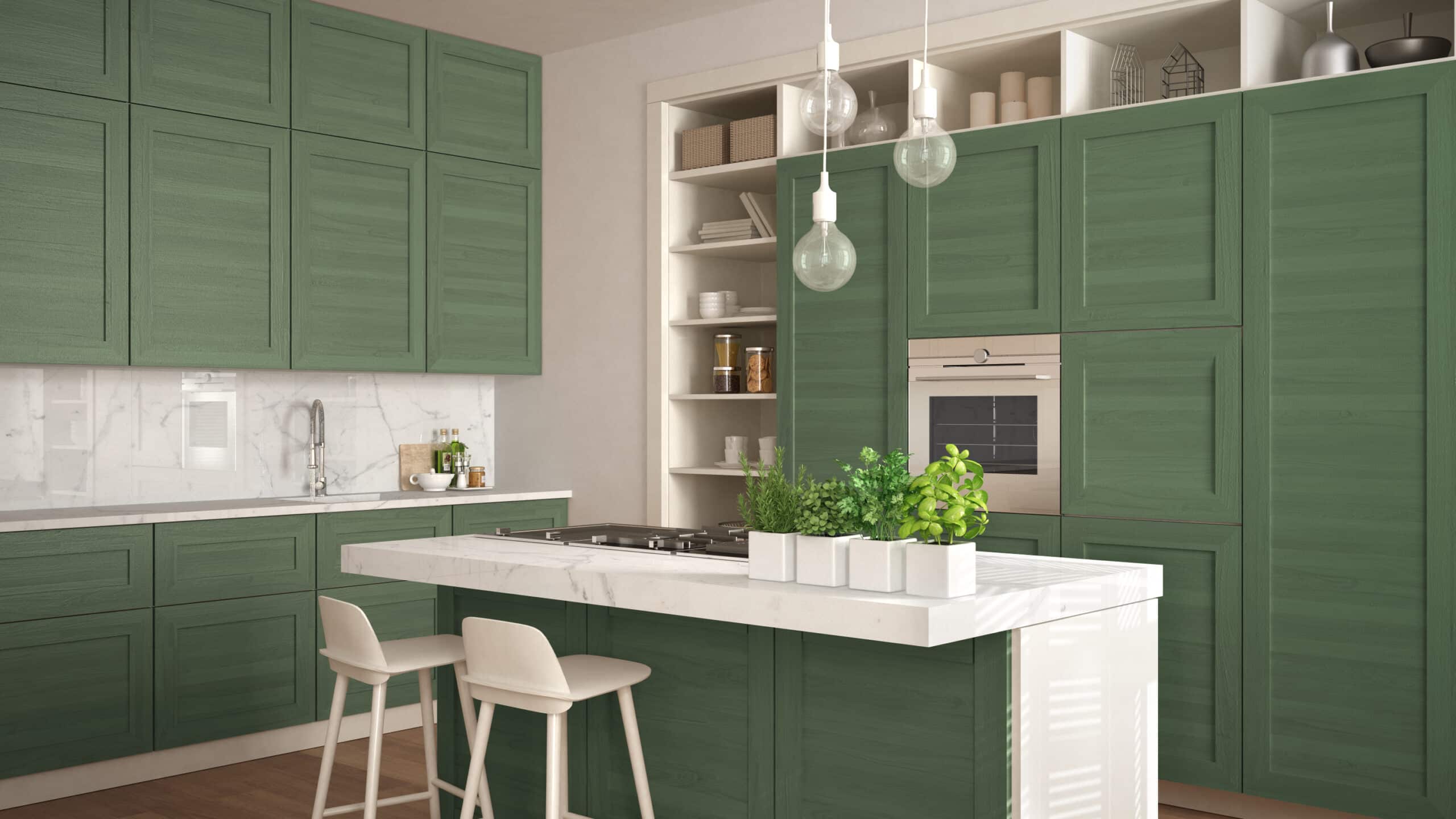
Designers reach for the 60-30-10 rule when explaining how to pick a second paint color. Your dominant pick takes 60 percent of the room, usually the walls. Your second color claims 30 percent on cabinets, trim, or a feature wall. The accent color rounds out the last 10 percent on a door or a key piece of furniture.
After you have the split, run three quick checks:
Try Your Color in the Tool Below
Before more swatches end up taped to your trim, drop your first color into the builder below. Pick the room, paste your hex code (or pull one from a fabric photo), and four pairings appear. The tool gives you a curated shortlist that already accounts for undertones and balance. It will not replace seeing a color on a real wall under real light, but it sets a smarter starting line.
YOU PICK IT, WE PAINT IT
Pair Your Color in Three Steps
Tell us which space you are working on
Pick your starting color three ways
Photo lighting and camera settings affect the sampled hex. Treat the result as a starting point and verify on the actual wall before committing.
Four pairings built around your color
Where Color Plans Tend to Break Down
Some homeowners settle on a partner at the paint counter, only to find the trim now reads green against the wall at home. Others lift a color from a styled photo online and watch the same shade fall flat on a north-wall accent. The most common interior house painting mistake is locking in the second color before the two colors have had a chance to live together in the room. The repaint usually shows up within six months. That is a second weekend lost and a second gallon paid for. Quality interior house painting depends on catching the mismatch before the first roller stroke.
What a Local Interior Painter Catches
A working interior painter does what no app or store display can replicate. They walk the room with you, study the floors and trim in person, and tell you whether a paint color pairing will hold from morning sun to evening lamps. Stockton brings light conditions that an algorithm cannot read. Strong overhead sun reaches deep into Central Valley homes from late spring through early fall. Stucco walls and open layouts bounce that light in ways that compress some colors and brighten others.
Pattern recognition built from hundreds of local rooms cuts the guesswork. It also stops you from buying a gallon of a color that was never going to fit. Quality interior house painting starts with reading those conditions correctly.